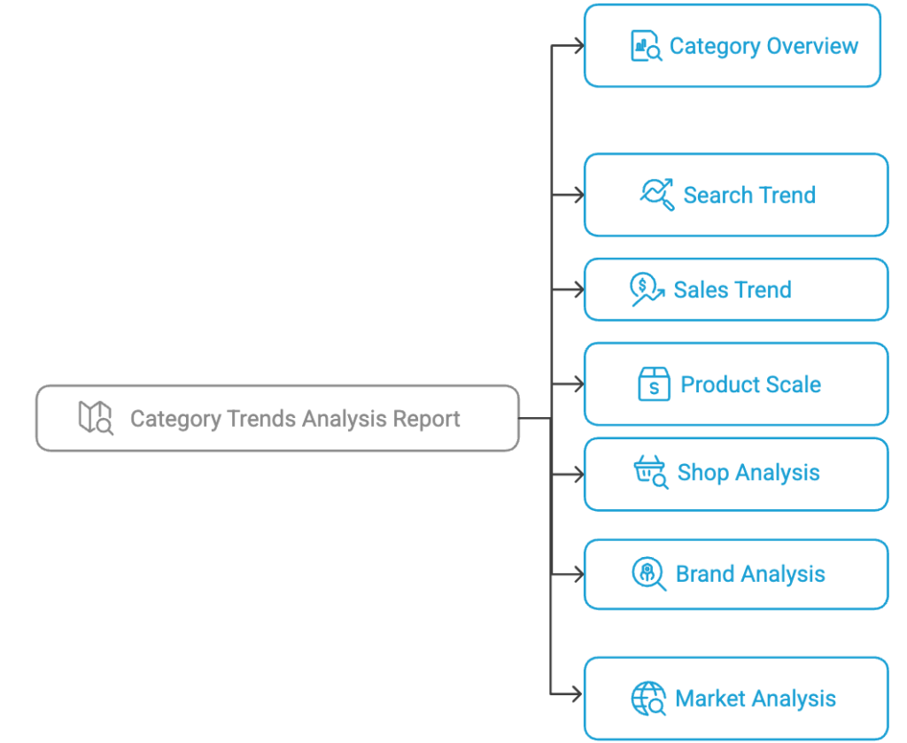
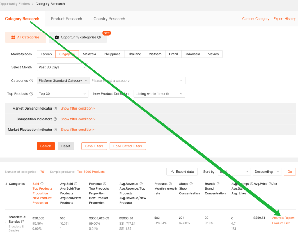
Click the “Analysis Report” view in the action area to access the Category Overview and the six core data dimensions: Search Trend, Sales Trend, Product Scale, Seller Analysis, Brand Analysis, and Market Analysis.
The sidebar allows for custom selection of the analysis time period, making it easy to track trends and changes within the category.

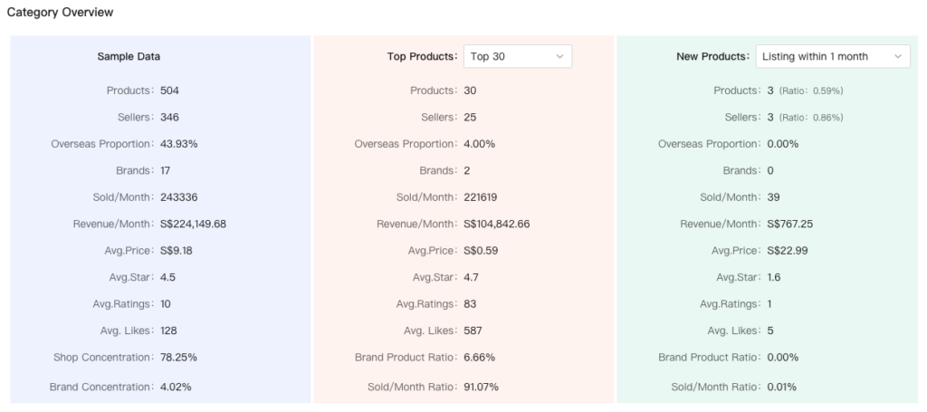
1. Category Overview
The Category Overview module provides a clear and intuitive view of the key foundational metrics within the selected category, including Sample Data, Top Products, and New Products.
The definitions of Top Products and New Products are fully configurable:
- Top Products: Can be customized based on sales performance. Available options include Top 30, Top 50, Top 80, and Top 100.
- New Products: Can be customized based on listing time. Available options include Listing within 1 month, Listing within 3 months, Listing within 6 months, and Listing within 12 months.
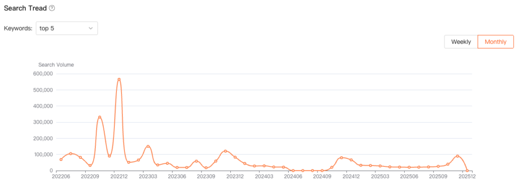
2. Search Trend
This metric selects the Top 5, Top 10, Top 30, and Top 50 core keywords within the category and presents their total search volume along with the corresponding search trend changes. It provides a clear indication of the strength of potential user demand.
A higher search volume suggests a larger user base with clear intent in this category, indicating a more solid foundation of market demand.
3. Sales Trend
The Sales Trend module analyzes two core data metrics: Sold and Revenue. Both metrics support flexible configuration using the following dimensions:
- Top Product (Top 30, Top 50, Top 80, Top 100)
- New Product Definition (Listing within 1 month, Listing within 3 months, Listing within 6 months, Listing within 12 months)
Table 1 displays the data through a combination of bar charts and line charts, providing a clear visual representation of trend changes over time.
A higher proportion of Top Products (shown in the blue bar chart and yellow line chart) typically indicates a more stable market structure, leaving less room for new products (shown in the green bar chart and red line chart). This suggests that it may be more challenging for new products to enter the market.
Conversely, when the proportion of new products shows an upward or stable trend, it may indicate structural opportunities within the market, suggesting that new entrants have a greater chance to acquire traffic and achieve growth.
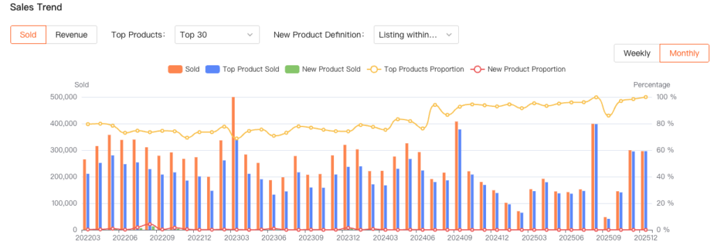
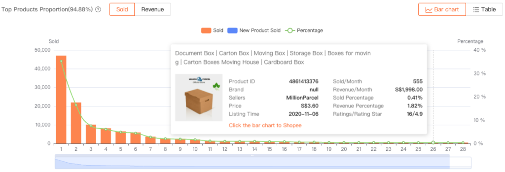
Table 2 presents the proportion of Top Products using a combination of bar charts and line charts, offering a clear visual display of their share within the category.
In the detailed analysis of the Top Products Proportion, the data shows that Top Products account for 94.88% of the total sales in this category. This high proportion reflects a significant concentration of sales, indicating a market where leading products dominate overall performance.
Clicking the bar chart reveals detailed information about the products included in these rankings.
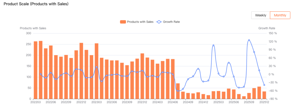
4. Product Scale
The Product Scale reflects the number of products within the category that have recorded sales, helping assess the overall level of market activity. The bar and line charts provide a clear visual representation of these changes:
- Bar Chart (left vertical axis): Shows Products with Sales.
- Line Chart (right vertical axis): Shows the change in the product growth rate.
A higher number of Products with Sales indicates that more products are generating sales, suggesting a more active and thriving market within the category.
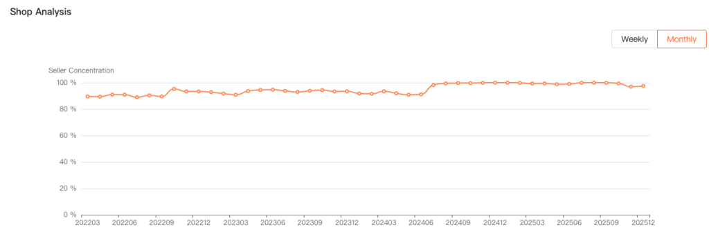
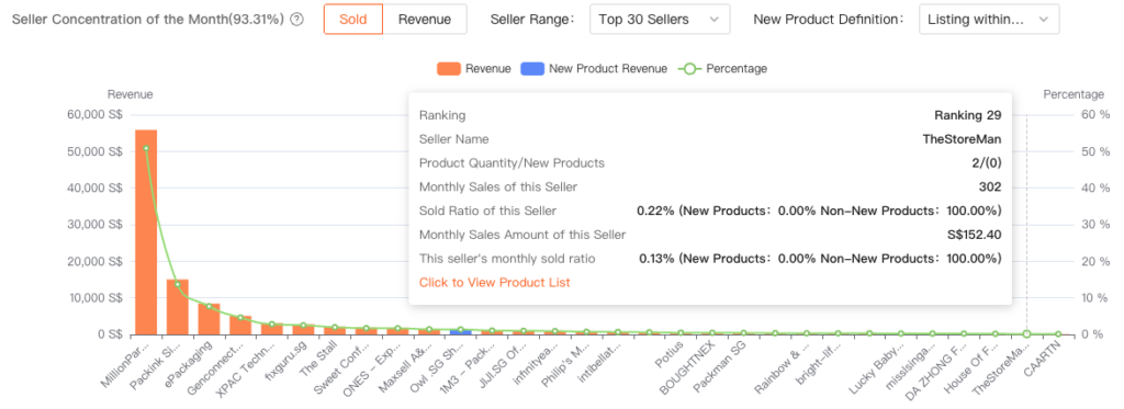
5. Shop Analysis
This module consists of two sections:
- Table 1: Seller Concentration Trend Analysis
Displays how seller concentration changes across different time periods. - Table 2: Seller Concentration of the Month
Shows detailed information about the top-performing sellers for the current month.
Seller Concentration:Seller concentration is calculated by comparing the total sales of the top 10 sellers (T) to the total sales of the sample products (A) within a specific period. Seller concentration is given by the ratio T/A, where A represents the total sales of the sample products.
A higher Seller Concentration indicates a higher degree of market dominance by leading sellers, meaning fewer opportunities for new or smaller sellers to enter the market.
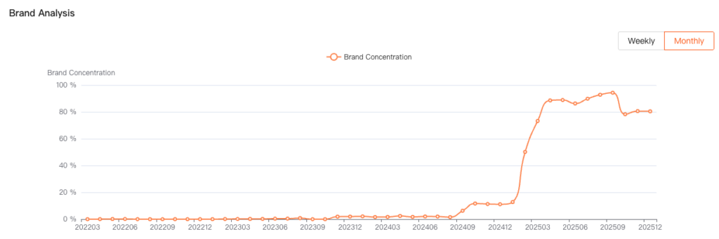
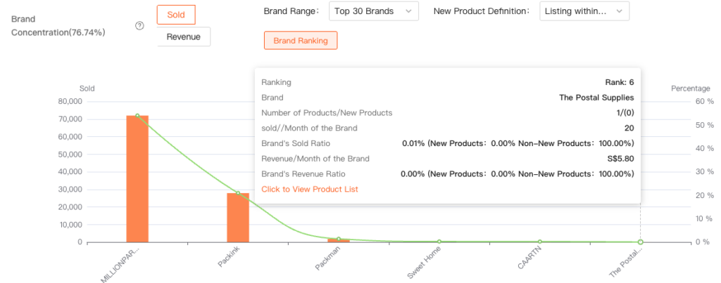
6. Brand Analysis
This module consists of two sections:
- Table 1: Brand Concentration Trend Analysis
Displays how brand concentration changes across different time periods. - Table 2: Top Brands of the Month
Shows detailed information about the top-performing brands for the current month.
Brand concentration :refers to the ratio of the total sales of the top 10 brands in a specific month to the total sales of all sampled products (A). It is calculated as the ratio of T/A, where T represents the total sales of the top 10 brands.
Brand Concentration is closely related to whether the market is becoming more concentrated around branded sellers.
A higher—or rising—brand concentration indicates that the market is increasingly dominated by leading brands, making the competitive environment more challenging for new or smaller brands.
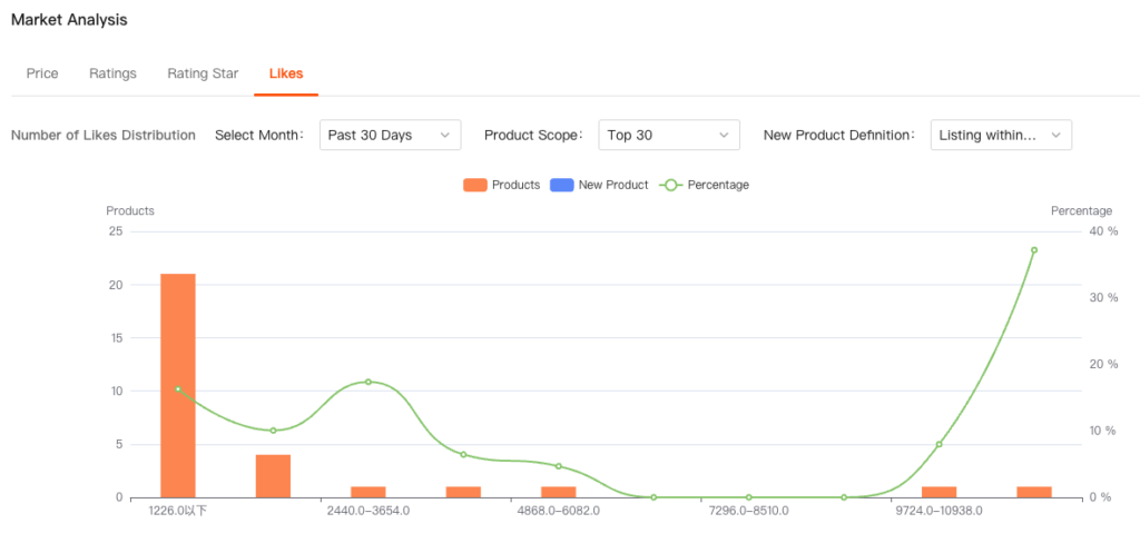
7. Market Analysis
The Market Analysis module evaluates user feedback and overall market performance from four dimensions: Price, Ratings , Rating Star , and Likes.
Among these, Ratings, Rating Star, and Likes directly reflect current user satisfaction levels within the category.
If these indicators are relatively low, it suggests that existing products are not fully meeting user needs. In such cases, sellers may have the opportunity to enter the market by upgrading or optimizing their products, thereby gaining a competitive advantage.